“Housing issue” is one of the favorite programs of those who are interested in design, home renovation and just like to look at all kinds of alterations. During its existence, many apartment owners, designers and builders participated in it. Most of those whose premises were redone were completely satisfied with the result. But there were times when the repair failed. This article presents the most unsuccessful repairs in the Housing Issue program, all of which are backed up by a photo. However, judge for yourself.
Content
Bad bedroom remodeling
The first alteration that we will talk about is the bedroom of Tamara and Evgeny Kachalov. They wanted their bedroom to have a brutal Gothic look. It was important for them to be dark. As a result, the room, on the contrary, brightened.
A plywood wardrobe appeared in it, designers placed cacti near the mirrors, and ferns in the corners. In general, the design turned out in the eclectic style.
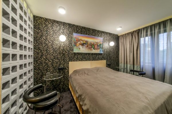
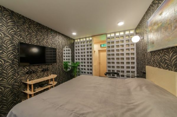
The room began to look more like an office, rather than a place for sleep and relaxation.
Therefore, the owner of the apartment was completely dissatisfied with the work of designers. He tried to contact them, but nothing came of it.
Read more: Where does Vyacheslav Zaitsev live (photo)
Cage Lounge
The Antipins family really wanted their living room to become spacious, so that they could receive guests in it, as well as spend time together. Designers wanted the room to turn into a garden of paradise, and as a result, a cramped cage was created.
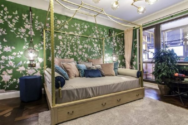
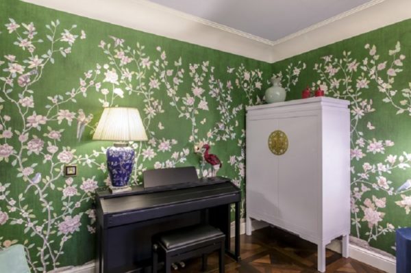
In the middle of the room they put a very large bed, on which a lot of pillows were placed. The walls were repainted in an ugly green color.
So, as we see, even in the Housing Question program, incidents happen. This suggests that designers do not always predict how their imagination will affect the appearance and functionality of the room.
Beautiful, expensive but impractical cuisine
Ksenia Avteneva from Moscow wanted to remake her kitchen. Repair of the premises, whose area was 10 square meters, cost 1.5 million rubles. The design, of course, turned out to be interesting, but completely impractical.
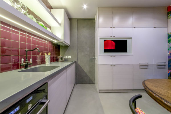
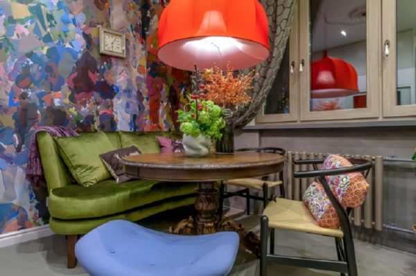
So, the faucet handle in the sink rested against the wall, and there was a gap between the countertop and the wall, which the owners later filled with sealant. Another impractical thing is the concrete walls and floor, which absorb oil and do not wash.
Read more:Chic mansion of Pavel Priluchny for 115 million rubles (photo)
Inconvenient kitchen with fireplace
The Muravyovs wanted their kitchen to turn into a Russian “hut”, with a beautiful and cozy fireplace. The repair was completely classified, but because the couple at that time lived with relatives. As a result, the design of the kitchen has been completely changed, but not for the better.
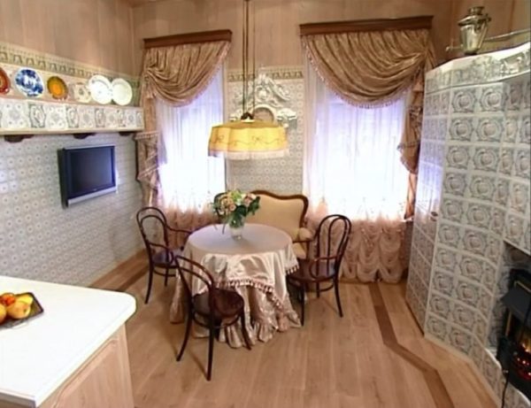
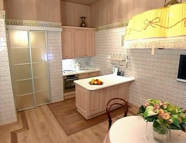
The most unsuccessful solution was the transfer of the gas stove, which is why the length of the hose increased from 2 to 6 meters. The kitchen became more like a closet, an ugly and uncomfortable fake fireplace appeared in it. The repair workers raised the floor very hard, which made it difficult to walk around the kitchen.
Read more:Very strange and beautiful place! Abandoned Pioneer Camp "Fairy Tale"
Strange living room
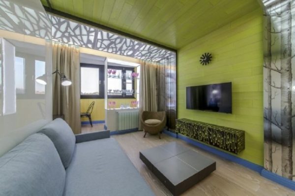
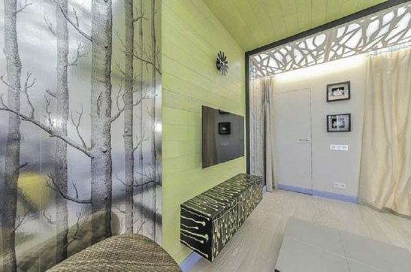
Ekaterina Gorokhovaya wanted her to have a new design of the children's room, but the editorial office offered her a remake of the living room. As a result, the new interior did not impress the landlady at all. The bedside table looked especially strange, the pattern on which resembled spermatozoa.Another strange and impractical decision of designers is a light carpet glued to the floor.
Gloomy kitchen
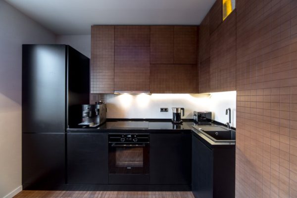
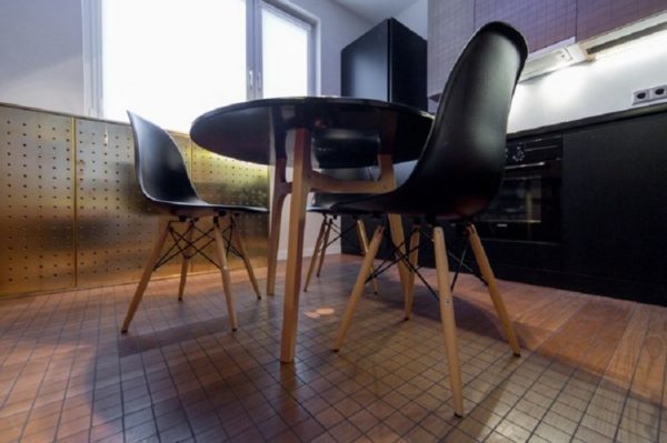
Another strange alteration is a kitchen for a family named Podroyko. People really wanted to gather in the evenings in a cozy room, which was too small before the alteration. As a result of the conversion, the kitchen became dark, too dark. Relief surfaces and a black chandelier appeared in it, which further narrowed the room visually and made it uncomfortable.
Read more:Houses and summer cottages of Oleg Tinkov (photo)
Kitchen for the theater family
The theater-goers family wanted to combine their small kitchen with the room and make repairs in warm colors so that there was more space. But, alas, 3 months of work did not bring the expected result.
The living room began to look more like an entrance than a living room.
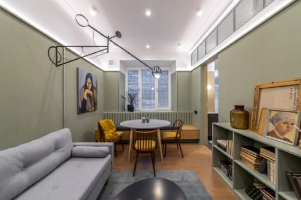
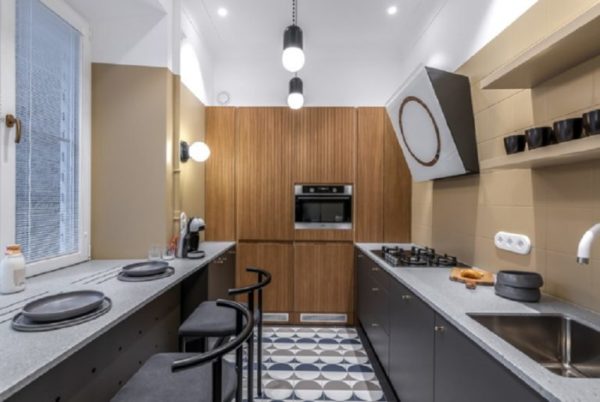
Designers never demolished the wall between the room and the kitchen, and the space as it was, remained small. The walls in the room were painted gray with a touch of olives, making the room very dull. Over the sink in the kitchen appeared completely non-functional and strange shelves.
Steamboat terrace
Natalya Filippova wanted designers to remodel the terrace at her dacha. Repair of this room lasted almost 2 months and was called the “White Steamboat”. The result surprised the hostess. The terrace, of course, turned out to be wonderful, but here the new sauna of the mistress of the dacha and the wooden floor were completely "killed".



Alas, no comments yet. Be the first!