In apartments of the old layout, especially in the "Khrushchev", often kitchens are small. But in a small space it is possible to place everything functionally. According to the design plan, everything is arranged so that there is no workload, but it was convenient to use both furniture and appliances.
3 rules of a small kitchen
- First you need to create a kitchen project. Define work and dining areas.
- The technique should be built-in whenever possible. She will save a place.
- Furniture should be at a minimum, it is advisable not to litter with unnecessary elements and not overload the decor.
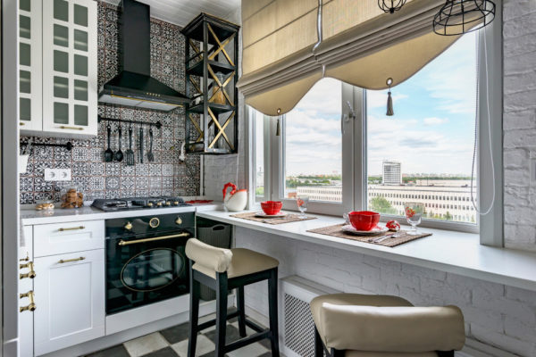
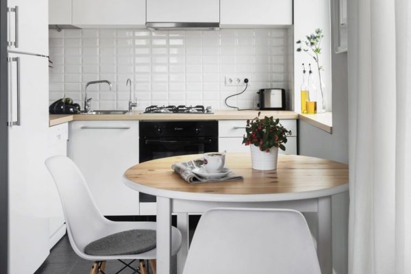
Read more: Dream Kitchen - 20 Design Tips
Choose layout
There are several options for the working area:
- Linear When the kitchen is straightforward, the work area is placed along one wall where communications are made;
- Two-tier. Hinged upper cabinets are open, closed, combined.
- U-shaped. Furniture occupies almost the entire space. If you place it correctly, you can get a functional room.
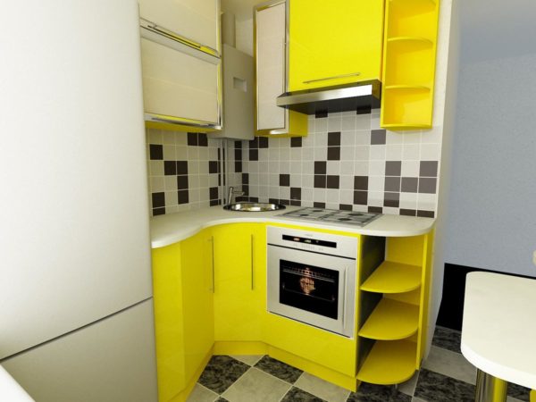
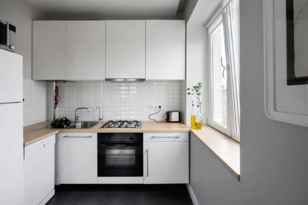
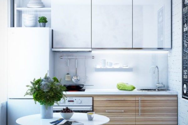
- L-shaped. The working area is on one side, dining on the other.
- Studio. In a small kitchen, the wall is demolished, combining with the neighboring room (often from the living room). Dining table is better to make.
Ideas for a small kitchen
Having decided on the layout, we begin to create a beautiful and modern room. Custom solutions are possible here.
Consider several design techniques:
- Work with the invoice.
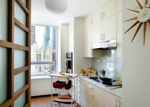
To add space you need a mirror shine. All matte surfaces are best replaced with glossy ones; they reflect more light. It is advisable to choose a white color, it creates a feeling of spaciousness. Light colors visually push the walls.
- Layout in the kitchen.
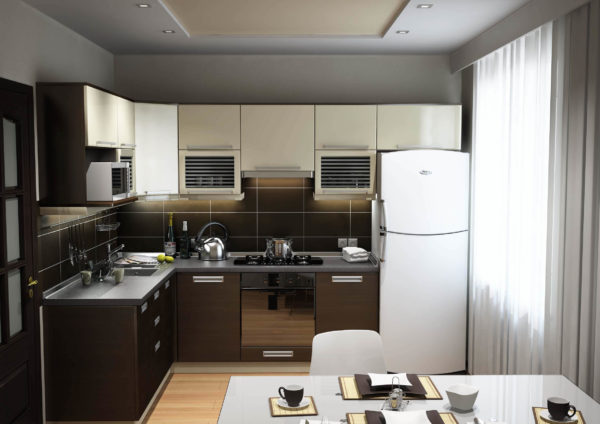
You can combine the kitchen with the living room, increasing the space, and you can expand the doorway or even refuse the door. Increase the number of cabinets due to two tiers.
Read more:Stretch ceiling in the kitchen - 70 photo ideas
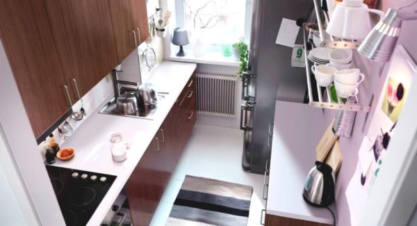
If the kitchen is very elongated, you can put furniture on one side. Two options are ideal: corner and linear arrangement of furniture.
- Joining the loggia.
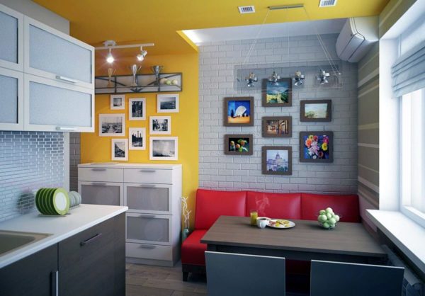
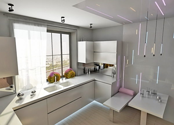
To do this, you need to warm it. The room will expand and more light will come. Zoning the room with the help of sliding doors, low or glass partitions, bar counter.
- Alteration of the windowsill.
If you remodel the space under the window into the countertop, it can be made folding, freeing up space. And when you make communications and install the sink, then the corner where it was located will be freed.
- Doorways.
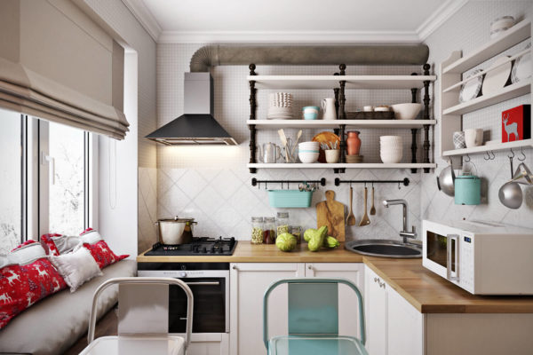
It is better to remove the doors, replacing them with sliding ones - this will visually free up space. You can hang bamboo curtains, rope or thread. Or remake the doorway into the arch. The lack of an open doorway is the smell of food in adjacent rooms.
Read more: Kitchen with an island in a modern way - fashion ideas (70 photos)
- Appliances.
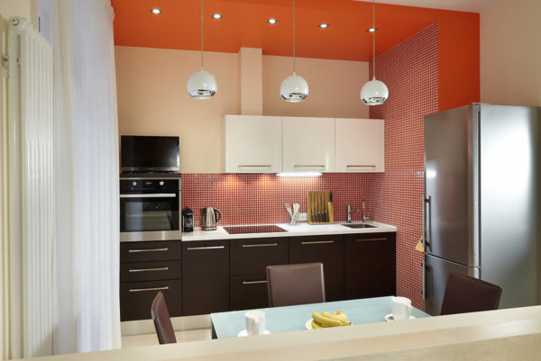
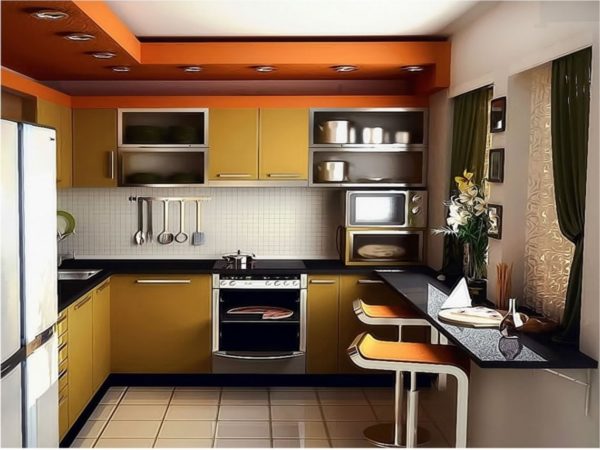
Better to buy it in small sizes. It must be built-in. It is desirable that it be multifunctional, for example, a microwave oven.
- Refrigerator.
We will talk about it separately. This is one of the largest items. It is very difficult for him to find a place in the kitchen. It is better to transfer it to the corridor or to the attached loggia. Well, if there is a niche in the kitchen, you can drown it there.
- Headset
Due to the small size of the room, furniture is best made to order. It is necessary to abandon the corner. Usually it is bulky and takes up a lot of space.
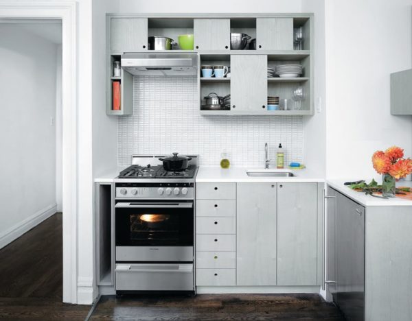
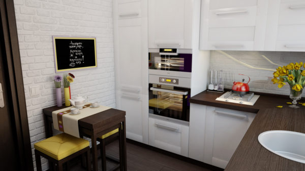
Furniture should be visually light, taking up little space. Mini-tables and folding chairs, which can be removed as unnecessary, always increase the space.
- Color spectrum.
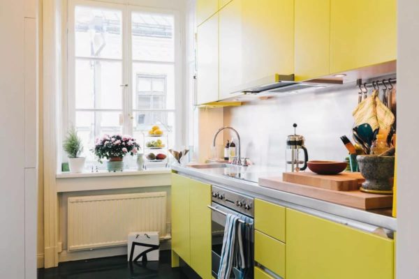
In small spaces it is better that two colors are present. The best option is light gamma. Sometimes you want bright spots. This brightness is transferred to the apron. It is undesirable to make it a particularly colorful spot, it will concentrate on itself all the looks.
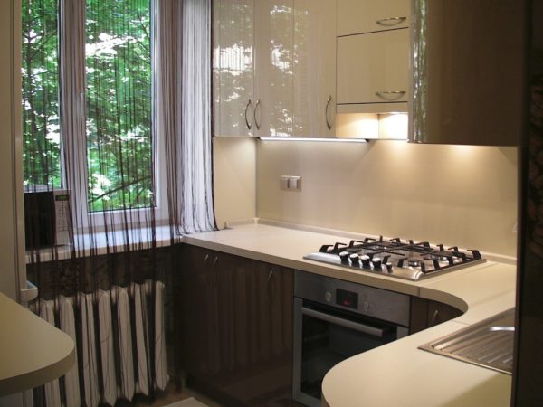
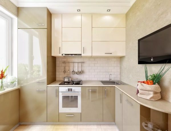
Floors, too, let them be light, because dark floors constrict space. If you still want a special accent, you can hang an unusual curtain, put a large pot with a decorative flower.
Read more: Rules for choosing furniture in a small kitchen
- Material selection.
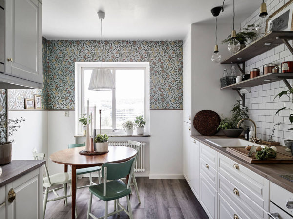
The finish should be light. No "marbled" materials. Light wallpaper or tile. The furniture is simple without monograms and carvings. The curtains are light, almost transparent. Heavy curtains will look ridiculous in a small kitchen.
The technique should be in harmony with the furniture. In the kitchen there should be no "discord". A dark fridge with a light-colored microwave looks awkward. In a miniature kitchen, everything should be in harmony.
- "Optical illusion".
For bold decisions, you can apply wallpaper with a picture of perspective. If the ceilings are low, they can be fixed with wallpaper with a vertical strip or pattern. To raise the ceiling visually, wallpaper in a rhombus will help.
- Facing with mirrors.
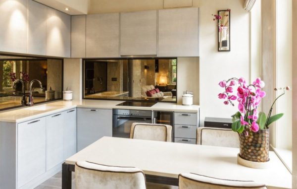
It is mirrors that increase space. If you hang a mirror opposite the window, more light appears. Facing an apron or one wall doubles the size of the room.
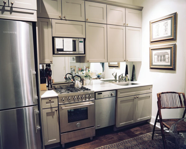
- How to fit everything.
Under the window, you can make a niche where to place all the bulk materials. Shelves can also be built directly above the door.
You can hang hooks on the door. If there is a refrigerator in a niche, hang shelves above it, and fold those things that are not often used.
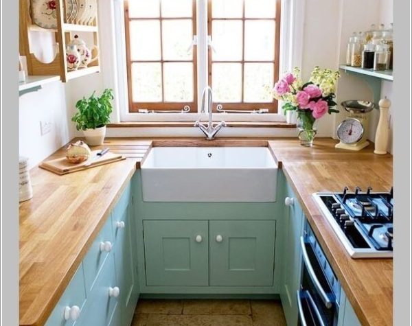
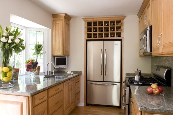
- Lighting.
The light of a familiar chandelier on the ceiling narrows the room due to incorrect reflection. It is better to use spotlights, they create uniform and soft highlights.
- Accessories and jewelry.
Small kitchens cannot be overloaded. Models of fruits and vegetables look tasteless. The painted plates on the walls resemble a museum. Heavy fringed curtains make a small room even smaller. The magnets on the refrigerator door are out of date.
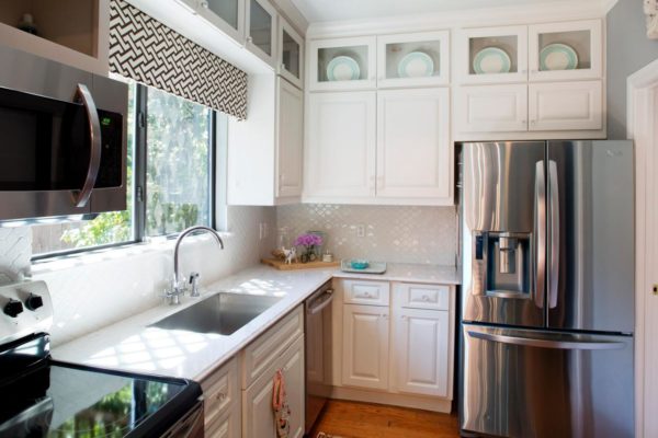
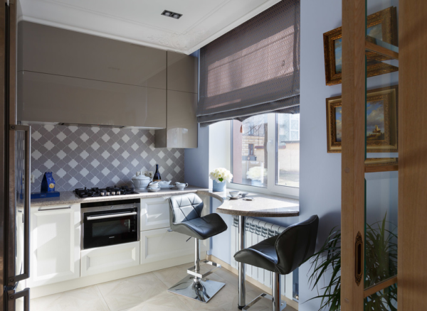
Any style made with love looks spectacular. It is necessary to observe cleanliness, do not leave dirty dishes, any inaccuracy makes the small kitchen cluttered.



Alas, no comments yet. Be the first!