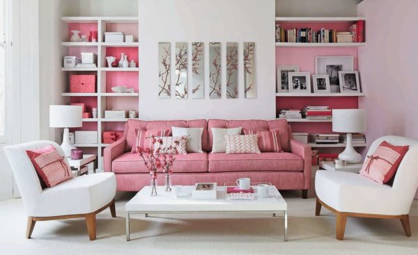
Romantic natures prefer sensual colors, pink is one of them. Fashion designers have long destroyed the stereotypes that this shade is inherent in young girls or exclusively blondes. Pink color looks great in the interior. They can arrange the whole room or competently focus on individual details.
The use of pink in the interior
Pink color promotes relaxation, gives a feeling of peace and comfort. But most importantly, when decorating the premises do not overdo it.
Read more: Kitchen apron - the best ideas of 2019
Simple rules will help you make good use of it:
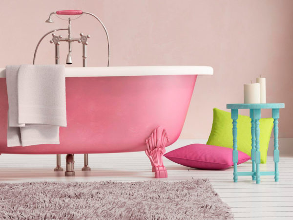
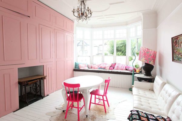
- To visually expand the space and make it lighter - just paint the walls in light pink. This rule applies to the bathroom. Each owner of a country house surely has old furniture that has lost its appearance (table, chairs), which is a pity to part with. With a flick of the wrist, things can be given a second life repainted in a strawberry shade.
- Pink color will be in perfect harmony with turquoise, black, white and orange shades, if the room is decorated in retro style. For a Provencal or classic style, it is better to use muted tones.
- For the main decor, it is good to use two shades, and in order to focus on a specific detail, one is enough.
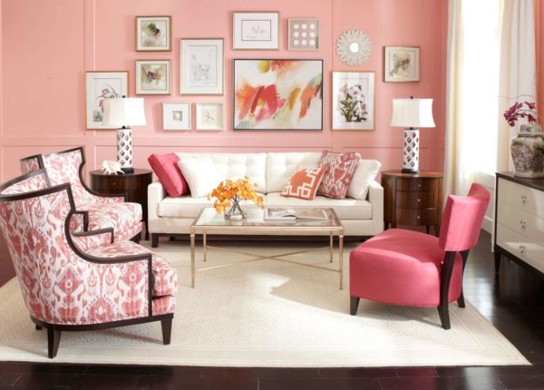
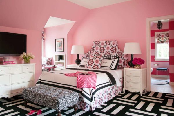
Furniture, color, lighting - everything should be in moderation. This is the best indicator of impeccable taste. If the intensity of the pink hue, which, incidentally, should not be more than 50%, is annoying - it does not matter. It is enough to combine it with black or lilac color.
What to avoid
The versatility of the pink color gives many opportunities in the design of the room. Despite its versatility, there are limitations. It categorically cannot be combined with red. This combination will lead to an annoying effect.
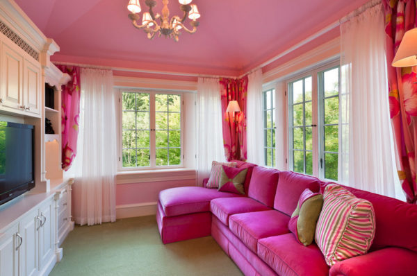
I would like to arrange the interior so that it pleases the eye and does not become boring. To do this, you need to learn one simple rule - large footage should not be painted in pink.
Read more: The library at home is fashionable! 22 design ideas
Now it’s fashionable to decorate the walls in a different color palette. It is permissible if one of them is pink. But even in this case, it is desirable to dilute this color with some element. For example, a picture, a lamp or a photograph.
Also, overlapping identical colors should be avoided. If the upholstered furniture is pink, the textiles should be any other.
Not the best decision to pick up a carpet or curtains to the pink ceiling of the same color. All details just merge together and get lost.
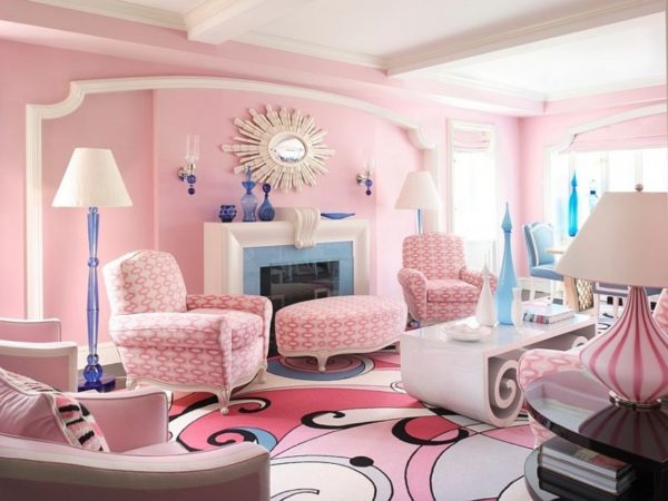
Pink is not compatible with blue. True, there is one exception. In these colors, you can arrange a nursery for heterosexual children. But in this case, a competent approach to business is required.
Good color combination
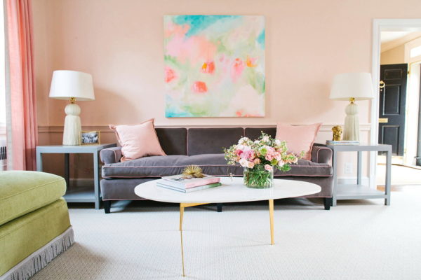
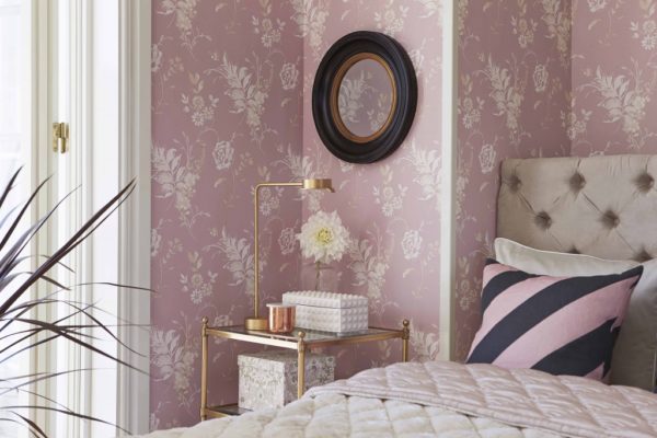
- Pink with gray, as if created for each other. They work great together, but the contrast should not be very pronounced. Designers often decorate bedrooms and kitchens in light gray and dusty or golden pink colors.
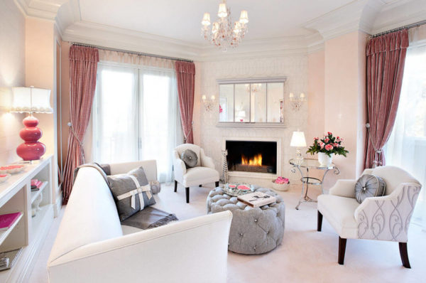
- For other living spaces, a mix of pink and beige is perfect. If you want to pay attention to details, it is enough to use the corresponding bright shade of pink.
Read more: Nautical style bathroom
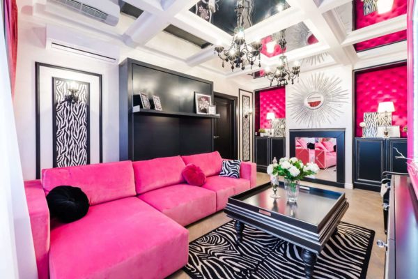
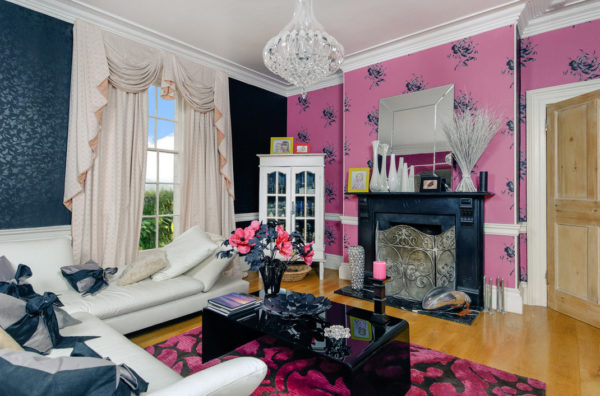
- In a modern interior, a combination of pink and black is often found. This is a bold decision and by no means everyone will be able to correctly place accents on their own. In this case, you can not do without white tones and wood.
- In the oriental style, which is gaining popularity today, a combination of pink and orange is often found. It is important not to overdo it. Everything should be in moderation. Otherwise, you get bad taste.
No need to be afraid to experiment when remodeling your home. The main thing to remember about a sense of proportion. If in doubt, seek professional help. They will tell you the most successful combination of pink, taking into account new trends.
Read more: How to make a headboard - the best ideas



Alas, no comments yet. Be the first!