Every year, experts try to offer as many ideas as possible, designed to implement the most incredible trends in interior decoration, to make them more unique and modern. But, chasing after the exclusive, we often make mistakes, which as a result reduce all our efforts to nothing.
By avoiding unforgivable mistakes in the interior, you can avoid a lot of mistakes, which we now consider.
Content
The same plain interior
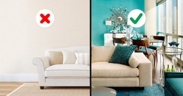
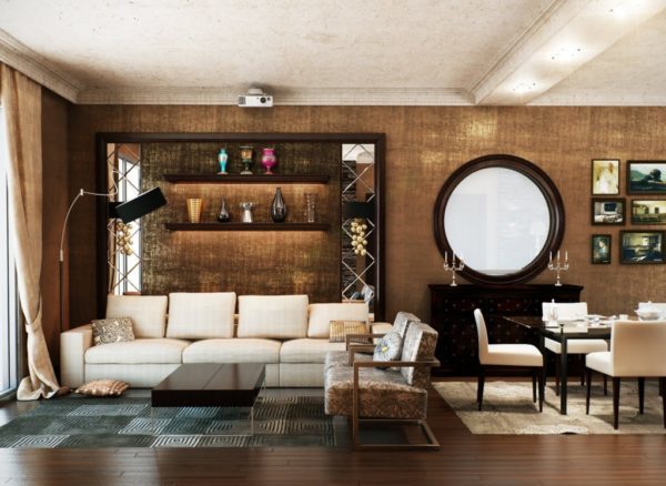
Colorful wallpapers, bright carpets on the walls and floor, furnishings with a strange print that does not fit into the design are considered quite old-fashioned for our time. Of course, the plain interior looks presentable and stylish. But the problem is that such an image becomes rather boring as a result.
Read more: Built-in furniture in the apartment - the best ideas
If you are interested in the fact that the planes of walls and ceilings were decorated in the same tone, and as a result were not similar to gloomy and ugly spots, then decorate the interior with brighter colors. No need to add grandmother's rugs and an old-fashioned chest of drawers with a sofa. Style should adhere to modern notes.
Overabundance of items
The variety of modern building materials used in the design solution, few can deter from unclaimed purchases.
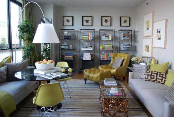
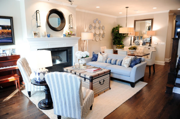
At first, people begin to decorate the room with small trinkets, after they occupy the entire free wall of the room with small paintings, then they introduce several vases, candlesticks, and jewelry boxes into the design.
As a result, the premises from a stylish image turns into a pantry, where together with this comfort there is a big lack of space.
Read more: Modern facade finishes - the best ideas in 2019
Props in design
Sometimes apartment owners make terrible mistakes. For example, many try to decorate their home with artificial flowers, put pictures with gilded frames. Of course, maybe it looks luxurious.
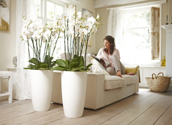
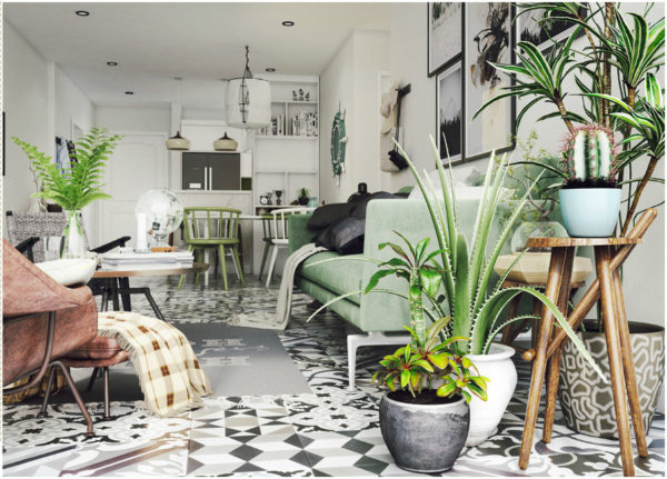
But in the courtyard of the twenty-first century, take a look at the other apartments. People no longer equip their rooms, moreover, all this does not fit into the interior of the room.
Furniture throughout the room
Previously, in almost every apartment you could see a picture where furniture was installed along the walls. Of course, this saves space. But even such savings should be reasonable, free.
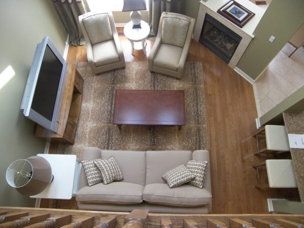
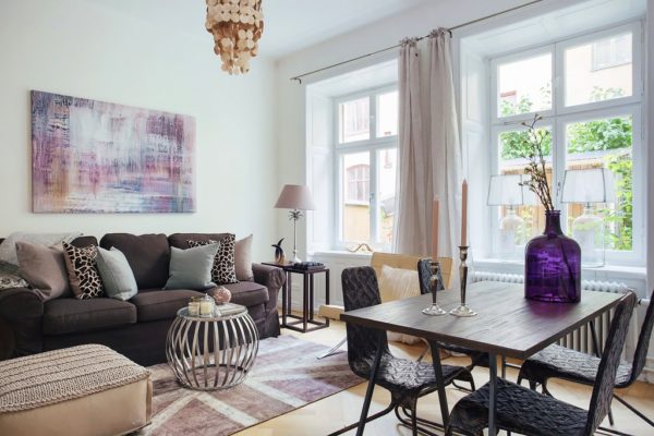
In this case, the central zone of the room most often represents a place for a dance floor.
Read more: Dream Kitchen - 20 Design Tips
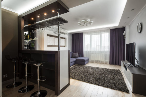
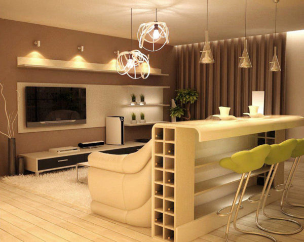
Bar counter
The bar counter is made for the counter of outlets, the height for the establishment is convenient, so you can hide any mess in the workplace. Nobody will notice dirty rags, napkins. For a home, this is an oversized invention.
The second office in the apartment
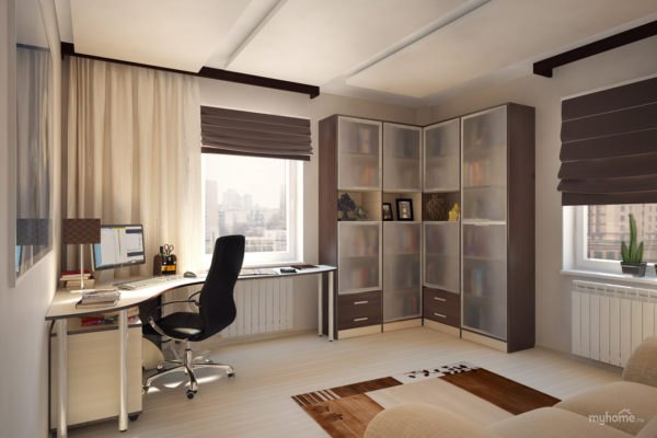
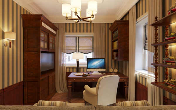
The second full-fledged study, located on the balcony, does not imply work, but Internet access.
Therefore, the second office is invented only by those who spend days and nights sitting at the computer, looking for something attractive to his eyes.
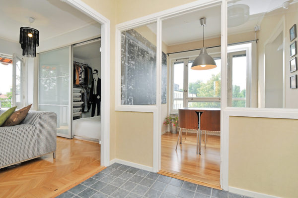
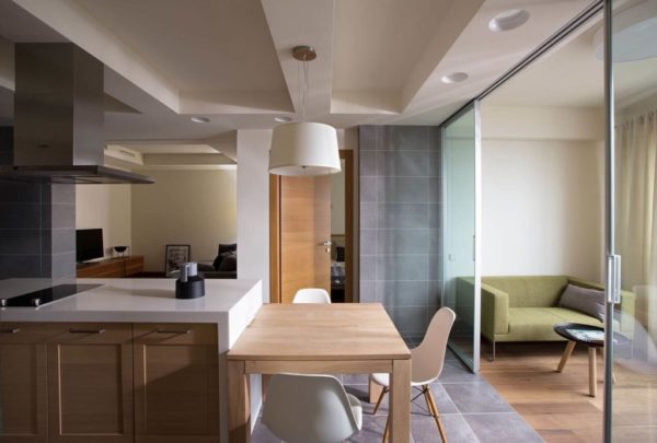
3 partitions in a studio apartment
At its core, the studio should be free from any clutter. This space is simply inseparable. Therefore, dividing it by partitions, you, as before, return to the apartment option. This should not be done, because maintaining coziness for the studio is optional.
Read more: 12 ideas on how to design an arched opening
Layout Errors
An apartment is an integral part of a multi-storey building. Therefore, breaking the load-bearing walls, as well as blocking the entire ventilation pipe, is not allowed here. It is also not permitted to introduce design changes. So any apartment looks cluttered and old-fashioned.
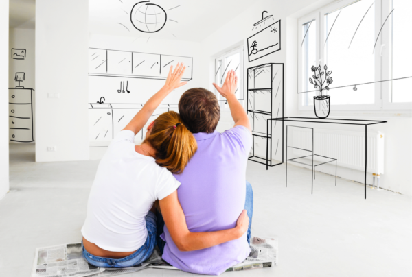
But all this can be eliminated if you talk with the designer of the house. That is, for this you should only seek the help of specialists who can identify all the bearing and non-bearing walls, in order to then realize the desired.
Misunderstanding of the area
Sometimes in apartments there are such cases that apartment owners clutter up the entire room with unnecessary things. They are trying to replace the corridor space with a wardrobe.

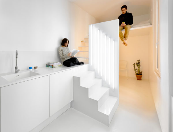
Live better with wide walkways, with a free entrance hall, as well as large rooms.
Did not provide
Sometimes it happens that when planning, they forgot to foresee where they would put chairs, a cot, and even a computer desk. These are quite important details that need to be determined for additional area. Or, for example, they planned to put a small sofa, but in the store they suddenly liked a large one.
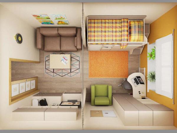
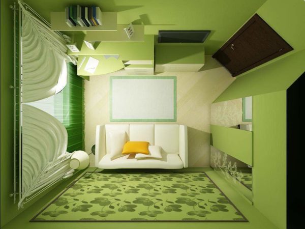
But the planned place is not enough, so they begin to push, rearrange the furniture again. Therefore, plan several options at once in order to measure everything after the size of your apartment and take care of the additional space.



Alas, no comments yet. Be the first!