Even the most ordinary interior of a kitchen can transform a well-chosen apron. Before addressing the issue of selecting materials for him, it is necessary for himself to answer a few questions. What effect do you want to achieve: make the apron an accent or leave it invisible? If you still have an accent, then how exactly: using material or color?
Kitchen aprons for every taste
In order not to be mistaken in the choice of materials, experts recommend collecting samples of each texture, facades, wallpaper, flooring, and draw conclusions based on these stocks. A large role in this matter is played by the dining table with chairs, lamps and other decorative elements, which should not only look beautiful against the background of the kitchen apron, but also successfully complement it.
Here is a small part of the design decisions that can inspire kitchen repairs and a complete apron replacement:
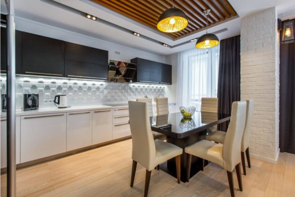
- White 3D
The white kitchen unit looks great with ceramic tiles of the same shade. Visually expands the space and makes the kitchen brighter.
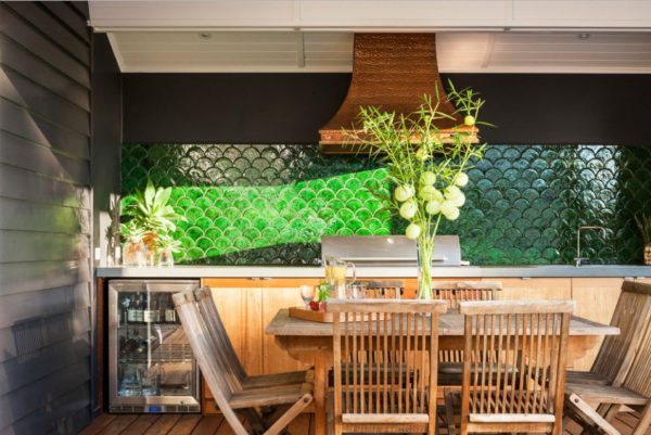
- Emerald scales
It fits perfectly into the eco-interior, the main material of which is natural wood. Juicy green attracts attention, but does not tire of its intensity.
Read more: Bed for a small bedroom (ideas with photos)
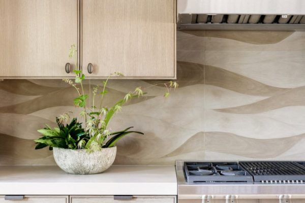
- Romantic waves
Such a solution on the one hand resembles the waves of the bay, on the other hand - it looks like a natural pattern of wood. Suitable for the kitchen in calm, beige colors.
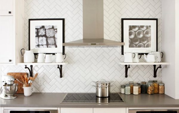
- New approach
Just a tile laid in a checkerboard pattern does not carry any design idea. But if you put it “herringbone”, then the apron will no longer look so dull and boring.
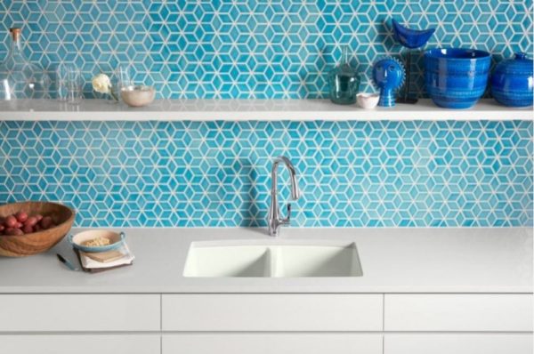
- Perfect turquoise
Unexpected to see such a shade of blue in the kitchen? by the way, scientists have proven that blue reduces appetite. The ideal solution for those who are constantly on a diet.
Read more: Fashionable interior in golden hues (40 photos)
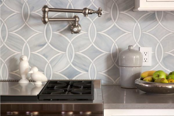
- Sophisticated lines
Only such a delicate and feminine tile can harmoniously look with a gray countertop. A minimum of additional decor, because such an apron does not need competitors in the kitchen.
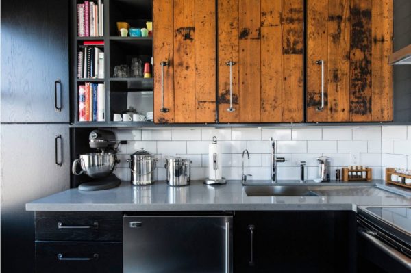
- Budget Above All
Standard white tiles, artificial stone countertops and stainless steel sinks, and the facades are finished with wood panels - this is how easy it is to combine organic motifs and industrial chic in one interior.
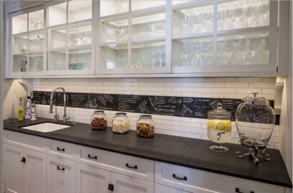
- Dark on light
Industrial, street style can be traced in this interior. The emphasis on the apron is given by a black, slate strip, in harmony with the countertop of the same shade.
Read more: Ideas for the design of the working area (photo)
- Brickwork
The visual unfinished apron is the highlight of the project. And the black-and-white facades of the headset and the tabletop under the tree complete the image of “careless environmental friendliness”.
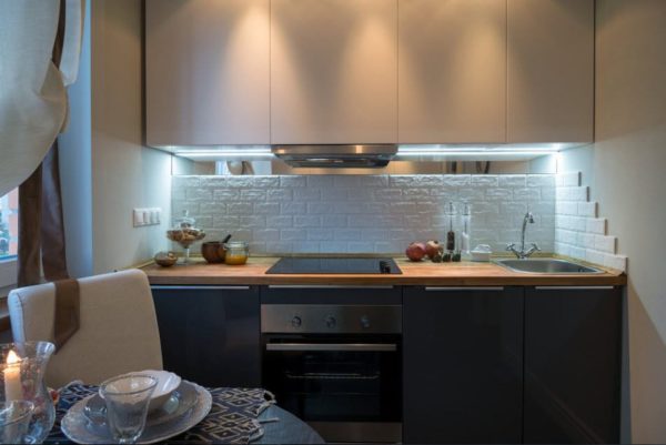
- Thumbnail to scale
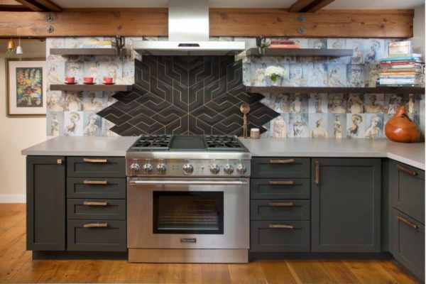
A large accent, surrounded by delicate images, attracts attention and does not allow you to take your eyes off this section of the kitchen. A dark facade and a tabletop made of light stone perfectly play against the backdrop of such an apron.
Read more:Interior from Drew Barrymore - actress became a designer
- Modern stove
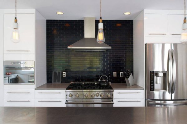
Black ceramic tiles, similar to burnt bricks and industrial large-scale hoods are associated with a real, Russian stove. And white facades only enhance this effect.
- Honey motifs
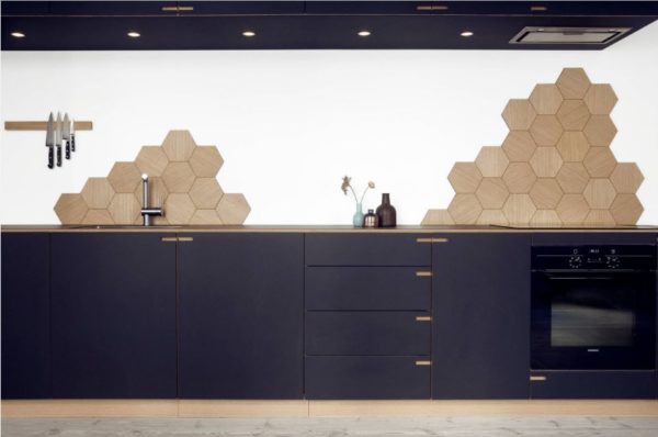
A few accents in the form of wooden honeycombs on an apron on a white background are minimalism that does not require any additions. The dark facade perfectly shades the interior and creates a feeling of depth. Honeycombs seem to soar in the air.
- Colorful honeycombs
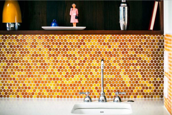
Another honey motif in the kitchen.It looks very impressive and appetizing, but you will have to try very hard with grouting.
- Country chic
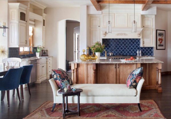
A blue apron made of ceramic, openwork tiles accentuates attention and is in perfect harmony with the Victorian style and wooden textures. Where, if not out of town, can such a combination of incompatible styles be found ?!
- Geometry in the interior
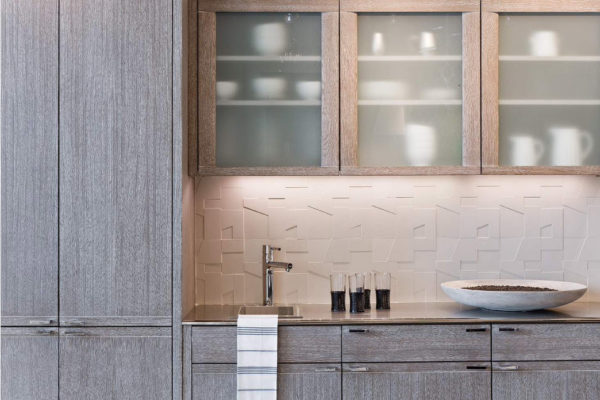
The set made of white oak and a monochrome apron look very elegant and elegant. And the geometry of the picture with the effect of natural stone complements the overall style and focuses on yourself.
- Masonry
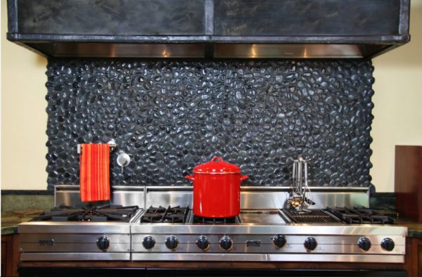
An apron stylized as black stone also relies on the original texture. Washing it is not easy, but what an effect!
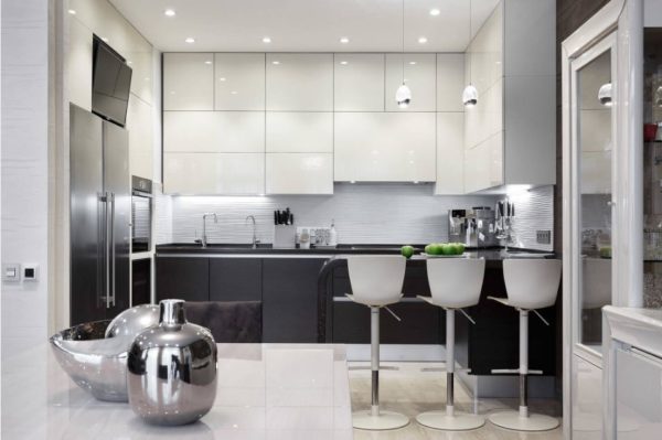
- Modern white
The horizontal strip, which stands out structurally on the apron, looks harmonious with glossy facades and dark graphite underneath.
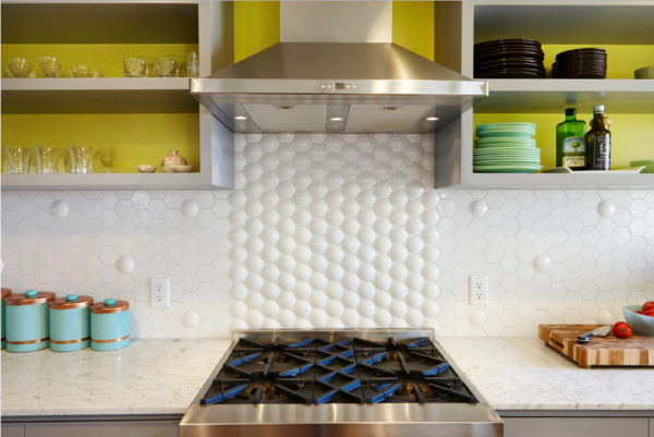
- Invoice bid
To draw attention to the apron without using bright and rich colors, an unusual surface texture will help. Tile with bubbles is a confirmation of this.
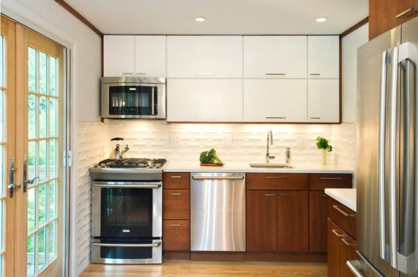
- White framed in wood
Another version of the textured surface, which, despite its neutrality in color, attracts attention. Even wooden facades and metallized appliances can not compete with her.
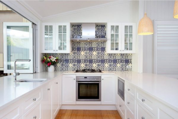
- Bright accent
Against the background of the monochrome facades of kitchen furniture, a bright apron made of blue tiles looks self-sufficient. To create a picture, several samples of tiles are used at once, which turn an ordinary kitchen apron into a work of art.
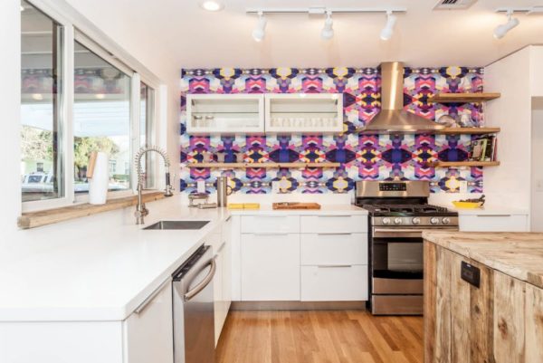
- Geometry Brightness
It is impossible not to pay attention to such an abundance of colors. White facades, as if dissolved against the backdrop of a riot of colors, which the designer, apparently, sought.
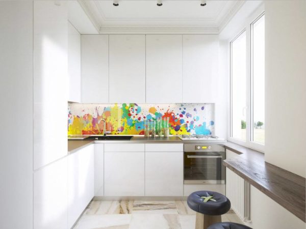
- Colorful spray
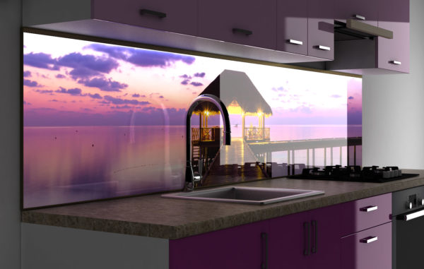
Another example of a white interior in the kitchen, the emphasis of which was a bright apron. Under the glass, you can put any image or wallpaper that successfully combines with the overall interior.
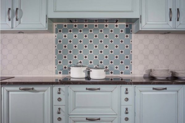
- Successful combinations
Against the background of a light and faceless apron, you can highlight the cooking zone with the help of color. The main thing is to choose the right colors and shapes of the tiles, and make the rest of the interior in neutral shades.
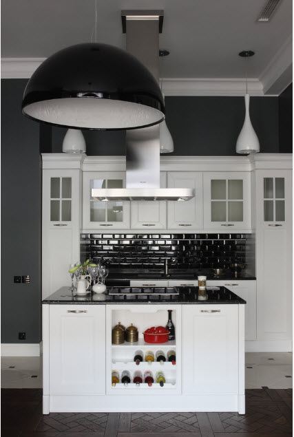
- Complete opposite
Black walls and the same color apron made of glossy tiles look spectacular in combination with white facades of kitchen furniture. The interior is complemented by lamps in the same style.
- Emphasis on contrast
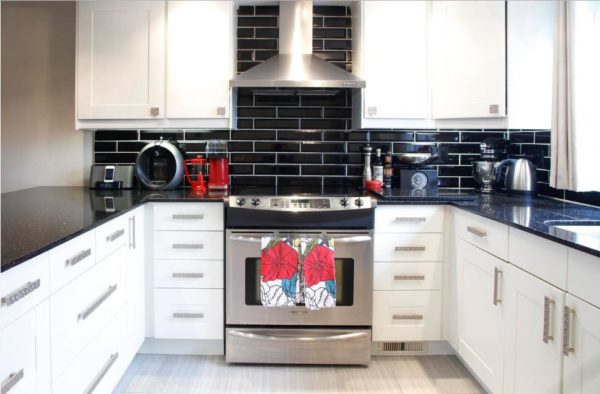
Another example of a successful game of color, in which the central object stands out - a stove with a hood. Black tile with white grout gives the interior rigor and clarity.
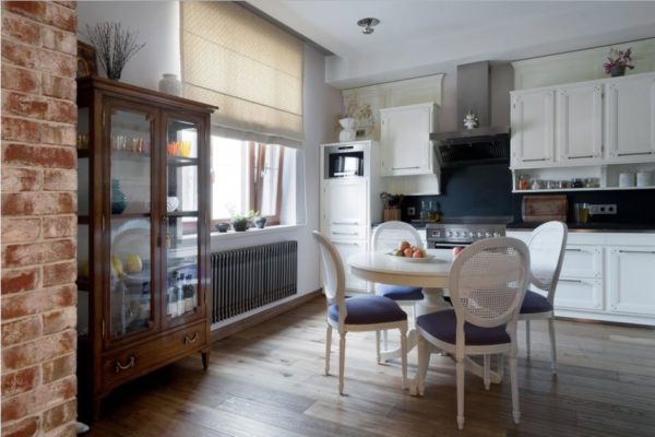
- Harmony in color
The colors that make up this interior, successfully resonate with each other. And all because black here is not flashy glossy, but terry muffled. Support apron flower pots and small details.
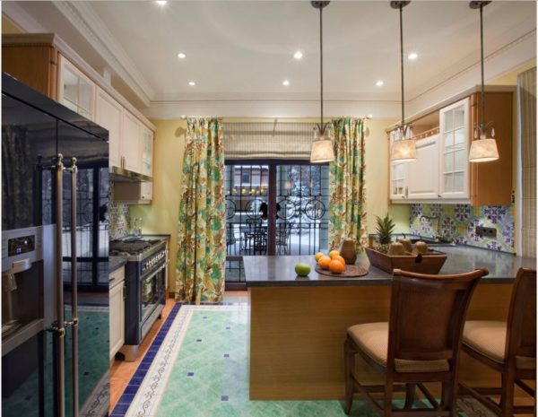
- Floor "rug"
Here, the floor tile successfully echoes the apron with colored ornaments. Fun, fresh and interesting. A textile that matches the style and color will complement the composition.
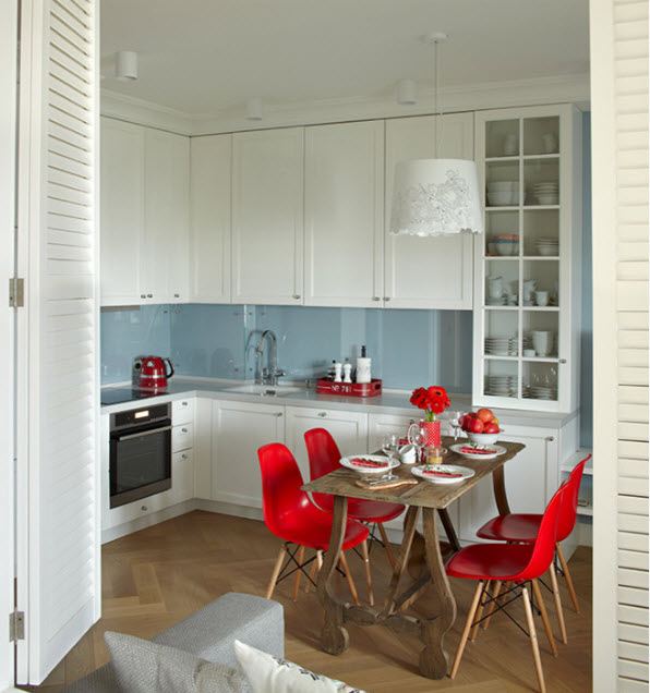
- To the tone of the walls
A kitchen that does not attract attention can do without an apron. You just don’t need to sculpt the tiles above the work surface, and close the wall with glass - stylishly, neutrally and practically.
Interior photos are known to inspire new ideas. Therefore - watch and fantasize so that your kitchen can also boast of an ideal apron.



Alas, no comments yet. Be the first!