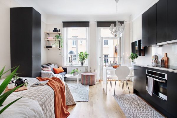
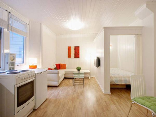
Most residents of modern Russia can not boast of large living space. On the contrary, many live in small-sized apartments, often in one-room apartments. But even the smallest Khrushchev or a modern studio apartment can be turned into comfortable apartments.
Designers offer many ideas on how to make the living area more functional and at the same time aesthetic. Let's consider some of them.
Content
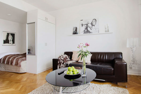
Separating zones with cabinets
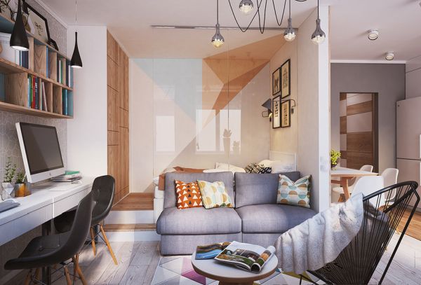
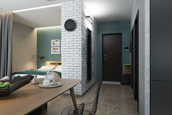
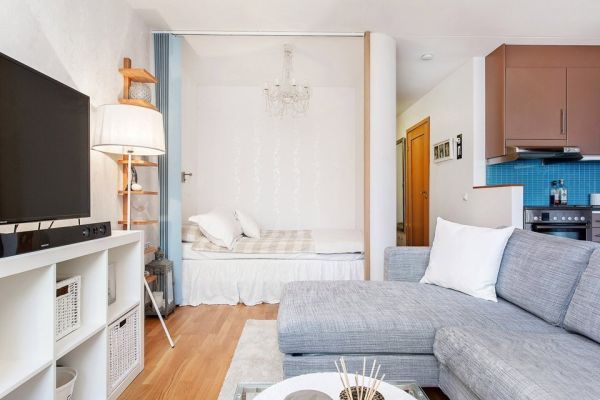
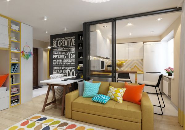
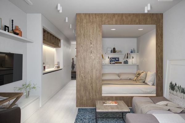
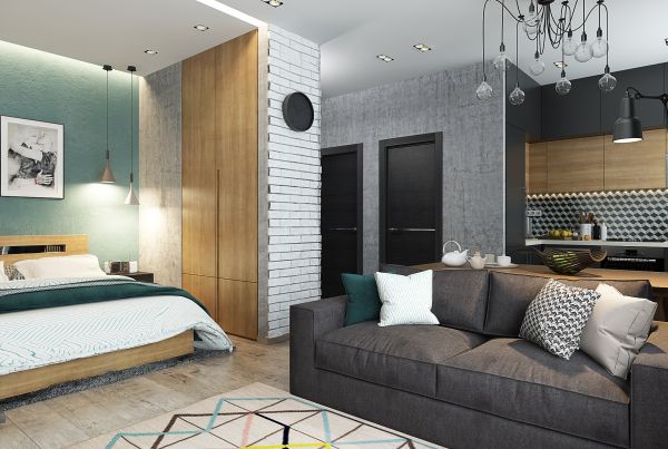
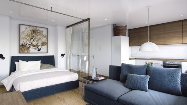
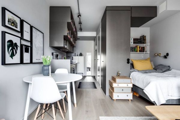
If you do not want to partition the space with the help of additional partitions, which will make the space visually cramped and dark, it is recommended to use cabinets as partitions. We are talking about shelves that do not have a back wall.
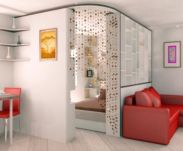
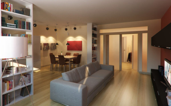
A rack, for example, the famous “Callax” from Ikea, can be placed between several different zones:
- study and living room;
- living room and bedroom;
- bedroom and study.
Read more: Natural motive in the interior (40 photos)
If the rack is used to separate the cabinet and bedroom, finding a convenient solution is even easier. In the same Ikea, as well as in many other stores, racks with an additional countertop are sold. Such furniture delimits space, and creates a place for work.
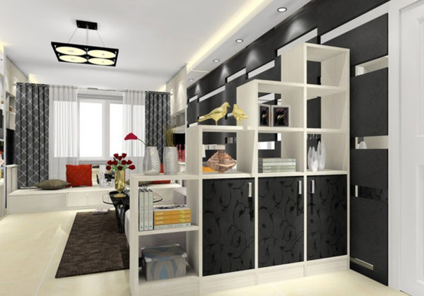
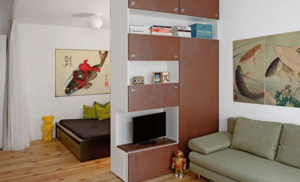
Spot light
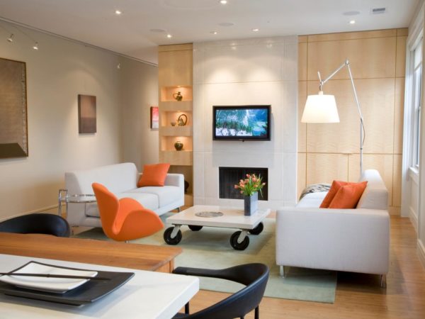
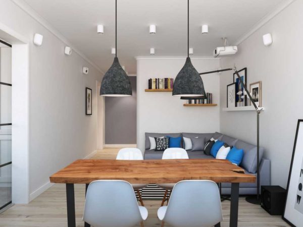
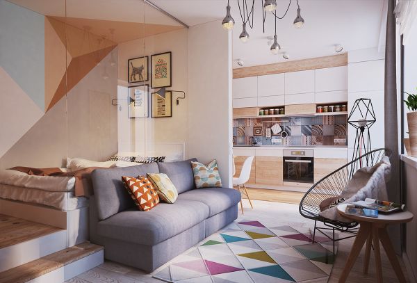
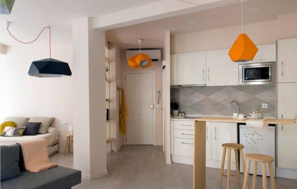
Another advantageous zoning option is the use of spot light instead of a common pendant lamp. Such lighting allows you to visually divide the zones of the kitchen, study, bedroom, living room. In addition, you can conveniently use lights without disturbing other household members.
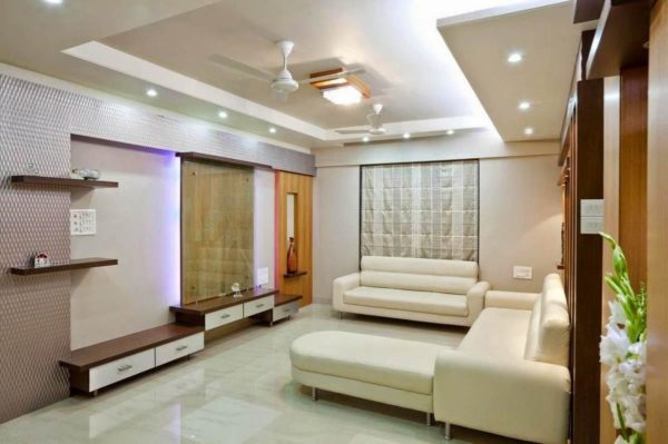
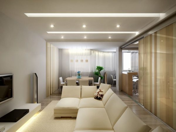
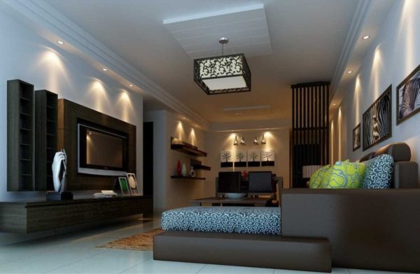
A simple example: a husband needs to complete an urgent work project. In order not to interfere with his wife, he uses a floor lamp located next to the desktop. It is far enough from the bed so as not to disturb the wife’s sleep.
Read more: English and American interior styles (50 photos)
The most common zoning methods with fixtures:
- lamps on a long wire above the bar in the kitchen;
- sconces over the bed;
- floor lamps for a recreation area (living room or free-standing chair);
- recessed lights for cabinets and hallway.
Bar counter
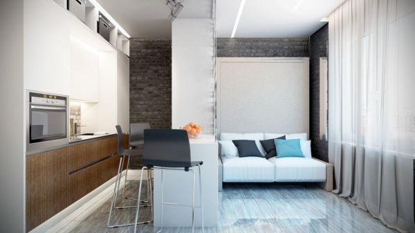
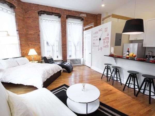
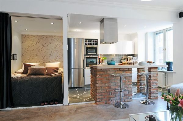
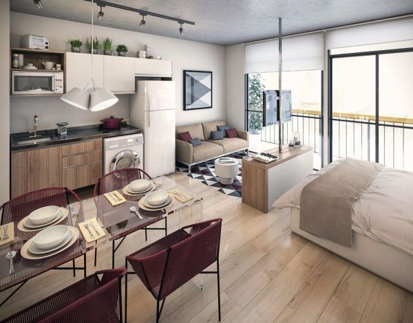
An ideal way to save space without harming aesthetics is to use a bar counter. It is beneficial immediately for several reasons:
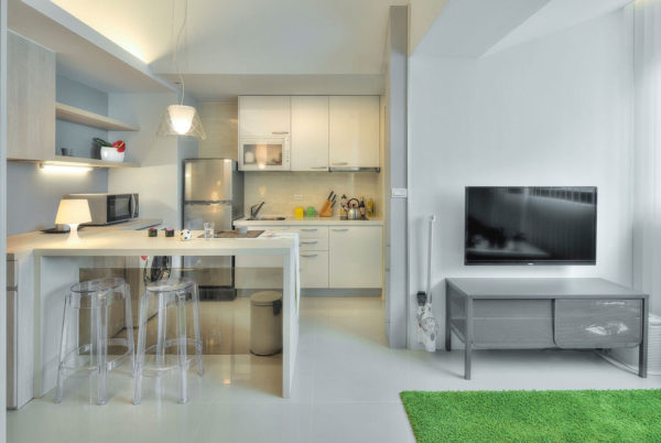
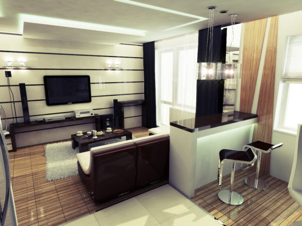
- a place for eating is preserved, but at the same time the bar counter is twice as narrow as the table and easily fits instead of the windowsill;
- due to the high location, chairs can be hidden directly under the bar, freeing up the area of the kitchen for cooking;
- The bar counter is suitable not only for eating, but also for creativity, work.
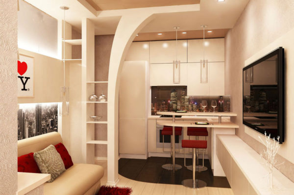
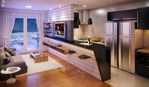
It is worth noting that such a countertop is not suitable for families with small children, as well as older people.
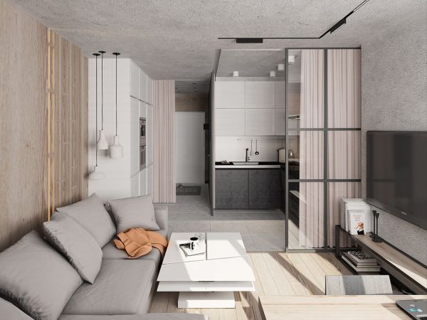
Sliding wall panel
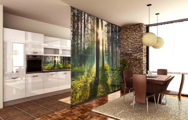
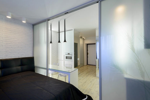
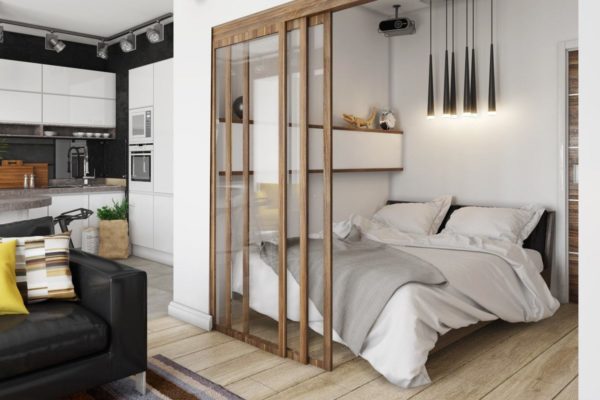
We purchased a studio of 30 square meters. m. and do not know how to correctly combine the kitchen and living room? A sliding wall panel is used.
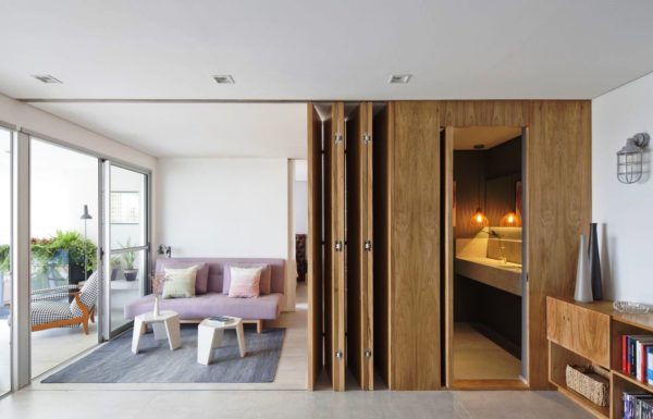
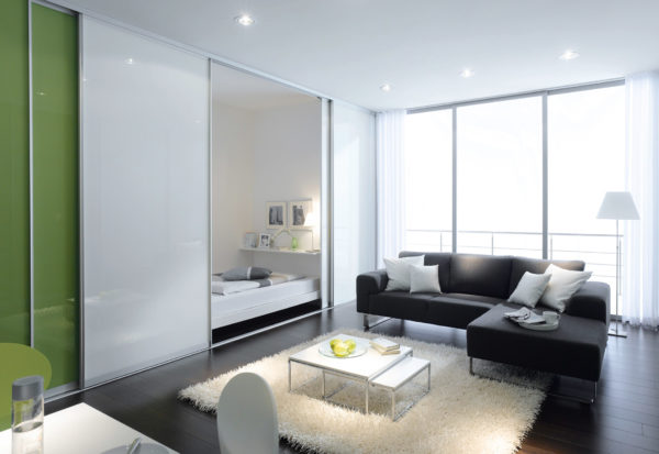
At normal times, she will close the kitchen, looking like an ordinary wooden wall panel. If necessary, it can be moved sideways and the kitchen set can be freed for cooking.
Read more: Photo printing ceilings - a new fashionable idea (40 photos)
Thus, while the owners do not use the kitchen, they can hide it in order to provide a more comfortable atmosphere. In addition, the shutter closes the countertop from dust.
Bright hues
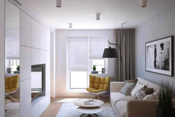
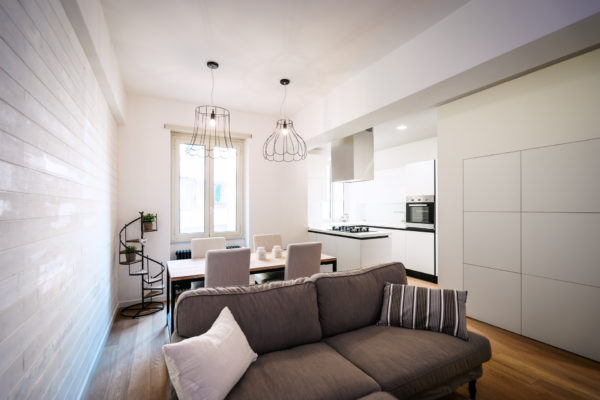
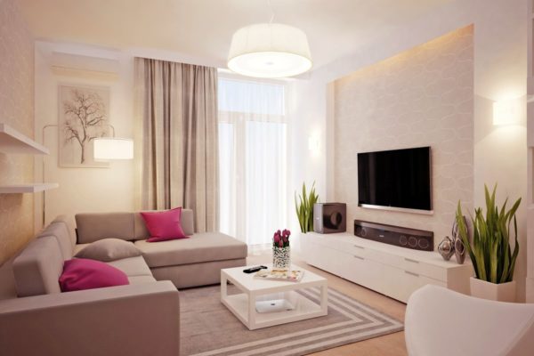
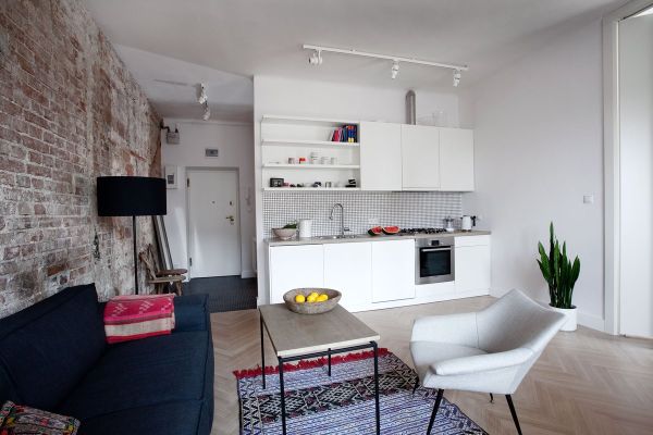
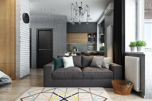
Try to use as little dark shades as possible.They make the interior overloaded and visually eat up the free space of the rooms. The ideal choice is white, light gray, beige.
You can not be afraid that the walls or upholstery of a light shade will get dirty too quickly. Modern manufacturers offer numerous paints, as well as textiles that repel dirt and are easy to clean.
Vertical stripes
If a one-room apartment went not in the Stalinist skyscrapers, but in an ordinary multi-storey building, obviously, the height of the ceilings will not be large.
Read more: How to choose furniture for the hall? 6 tips
In combination with the small size of the apartment, this creates an additional feeling of crowding. Solving the problem is simple using wallpapers or installations with large vertical stripes.
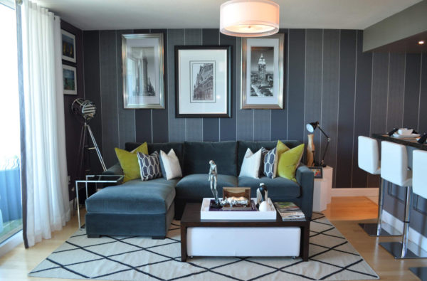
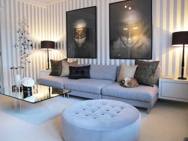
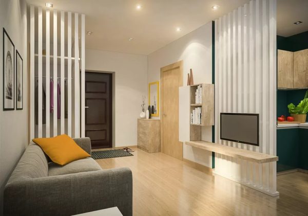
They visually increase the height of the room. However, it should be borne in mind that there may be a reverse effect - the room will narrow as it were, which will make it seem insufficiently spacious. This can be corrected by applying a striped print on only one or two sides of the room.
Built-in wardrobes with mirrors
There is no room for a dressing room in odnushka, but it's still worth taking care of functional storage. It’s best not to waste space on sets of furniture for the hallway with open hangers, but to immediately place a closet from floor to ceiling with sliding doors at the entrance.
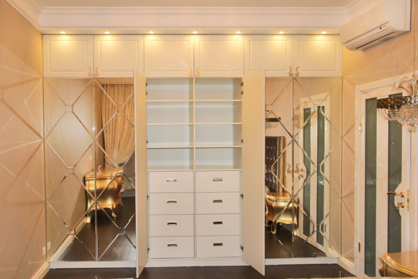
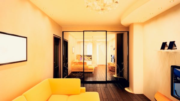
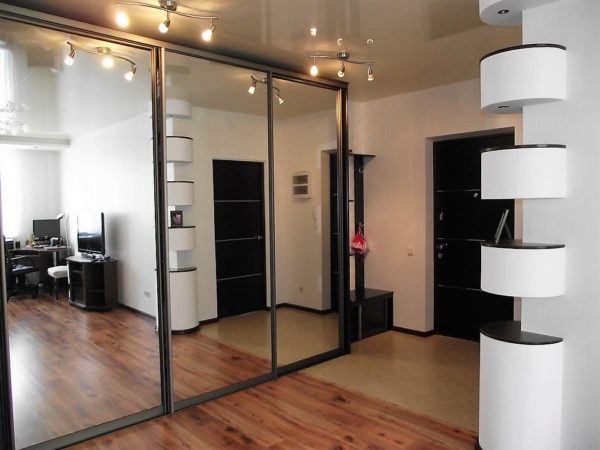
If you add high mirrors to their canvas, you will feel as if the corridor (or room) is twice as large as it really is.
Folding tables
If at home you do not arrange a feast for 10 people and do not work at a computer, then instead of standard countertops, you can use folding.
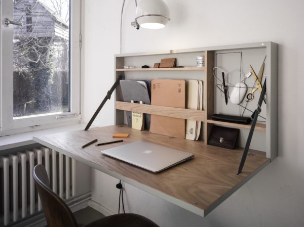
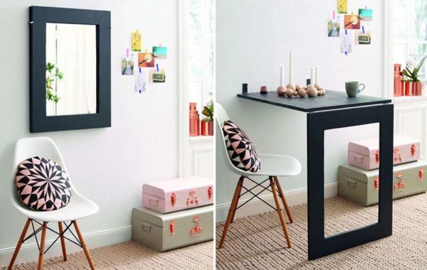
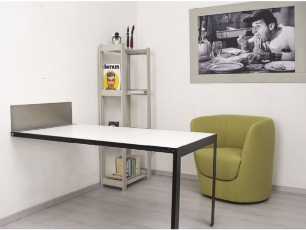
In the folded position, they are pressed against the wall and do not take up space at all. The tabletops unfold very quickly: it is enough to raise the main plane and fix it with a support.
Loft bed
Young people, as well as single people who prefer not to have romantic meetings in their apartment, will appreciate the option of saving space with an attic bed.
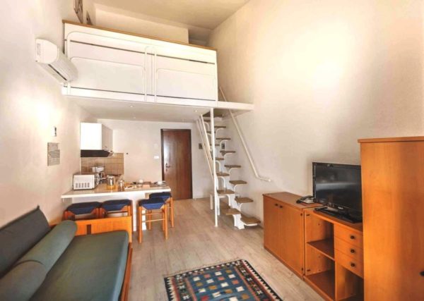
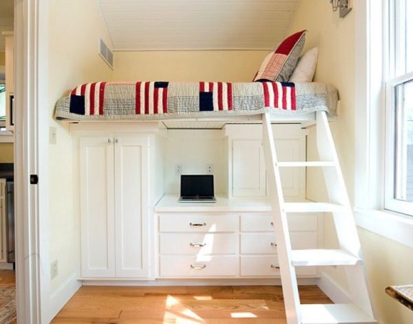
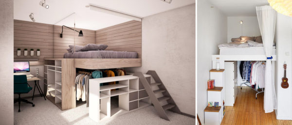
The essence of this design is that instead of the first tier of the bunk bed, the owner receives either a work desk, or a place for a sofa or chair, or a storage system with several cabinets and a chest of drawers.
In apartments with a ceiling of about 3 meters under the loft, the owners even arrange whole wardrobe rooms. As for the bed, it can be either single or double.
Conversion of the balcony
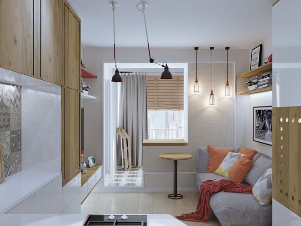
Even in addition to small one-room apartments, there is often a balcony. This is a space giving at least 4 additional square meters. m. of space.
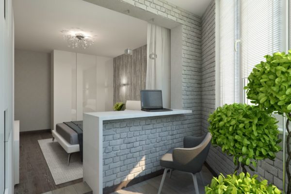
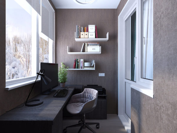
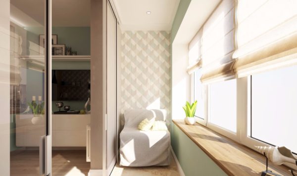
Although initially balconies were not intended for permanent residential use, the rules do not prohibit glazing and insulation of a balcony, and then use it as an office or an additional resting place. It is best to create an office: the balcony is separated from the main part of the apartment, insulation is provided.
Glossy stretch ceiling
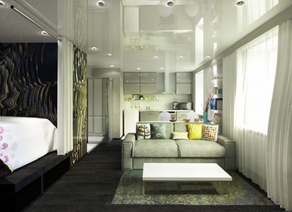
If you want to achieve a visual expansion of the space, but do not want to make the walls light or striped, you can resort to stretching the ceilings.
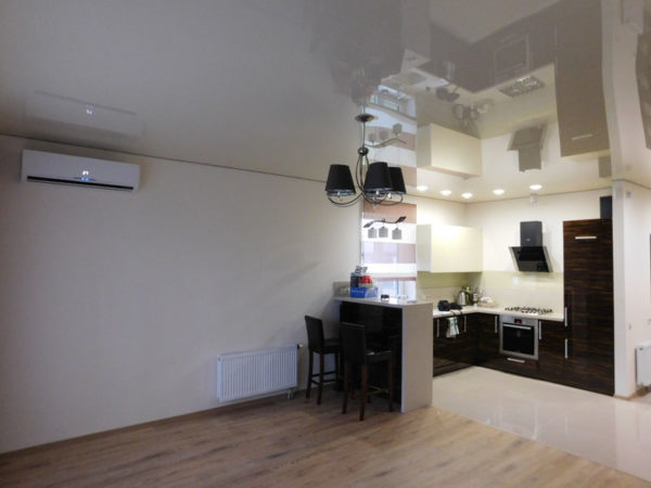
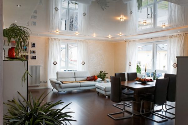
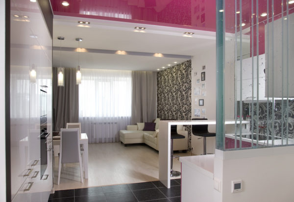
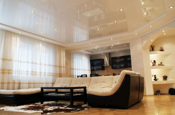
The design takes away the extra 5-10 cm, but visually the space will expand. The glossy sheen of the material will achieve this optical illusion.
If you want to achieve maximum design harmony, it is better to use the services of a designer or install a 3D modeling program that will allow you to design your own interior.



Alas, no comments yet. Be the first!