Only one who lives all his life in a small apartment can understand what problems arise in a small kitchen. Over time, a person gets used to be content with minimal space and use the most necessary. He manages to compactly fold items for cooking. But after some time there is an active rejection of the existing situation, especially after going to visit a house or apartment where there is a large kitchen. The spectacle of a spacious room, where each object has its own place, involuntarily causes a desire to somehow optimize the space. But the lack of specialized knowledge makes repair a trial and error method.
Content
First and main: reasoning on the topic
Almost every woman is confident in her own infallible taste and design talents, which is why the initial implication is the rejection of the services of a designer who has the necessary skills and programs.
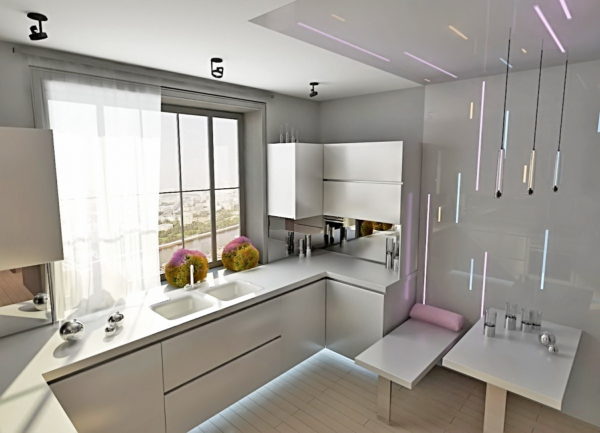
Perhaps the hostess really tastes great, and she is able to opt for an advanced kitchen set, equipped with the latest trends in kitchen fashion.
But she is not able to at least roughly imagine how and in what corner to place the acquired lockers to ensure the presence of a small working triangle with complete freedom of movement. And it is necessary that at the same time in a tiny room there should still be a refrigerator, stove, sink, and sometimes household appliances.
Read more: Kitchen set for a small kitchen in Khrushchev - ideas of 2019
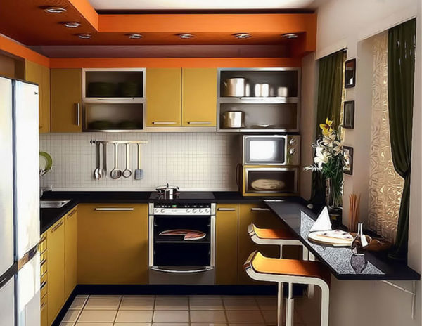
The services of the planner will help to arrange items with maximum efficiency, indicate where the electrical outlets should be located so that there is no need for extension cords, determine what you can do without and what can be operated in a compact form. If only one housewife works in the kitchen, the optimum height of the countertop, sink, hanging cabinets, calculated on the convenience of a particular person and preservation of his health, will be displayed.
Ergonomics is not the science of how to squeeze the largest number of objects into a specified space. These are the developed principles of its rational use. Rational, in this case, also does not mean that literally every centimeter will be hammered.
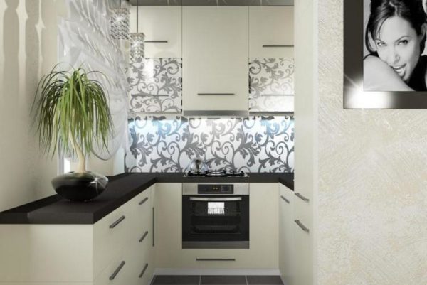
This is a reasonable tactic for taking out objects that you can do without. Or combining functions in one accessory furnishing two or more things that you may need.
The modern furniture industry, of course, is working on the ergonomics of kitchen sets - just look at the drawers that are pushed to the end without the least effort and congestion, and retracted with one smooth movement of the hand. You should pay attention to the mobile modules, which do not need to be hung together, or look at the corner cabinets that allow you to use an angle that is usually not filled due to the inability to open the doors in the wall.
Read more: Design of a kitchen combined with a living room - ideas of 2019
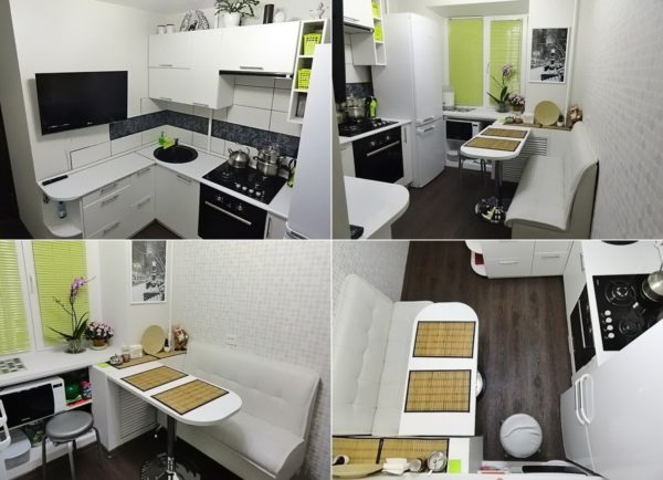
The first and main mistake in replanning a kitchen is the lack of a well-thought-out layout: that is, turning to a programmer for a rational layout scheme. No one says that he will dictate any restrictions in color compatibility or decoration of objects.
He will simply put together a virtual puzzle, indicate the optimal parameters of furniture and the minimum permissible distances to objects that have limitations in this:
- refrigerator - from the wall, radiators and sunlight;
- gas stove with its heat dissipation and a spray of fat;
- sinks - with possible overflow, leaking and minimal functional area;
- countertops - if a cupboard or washing machine will be placed under it.
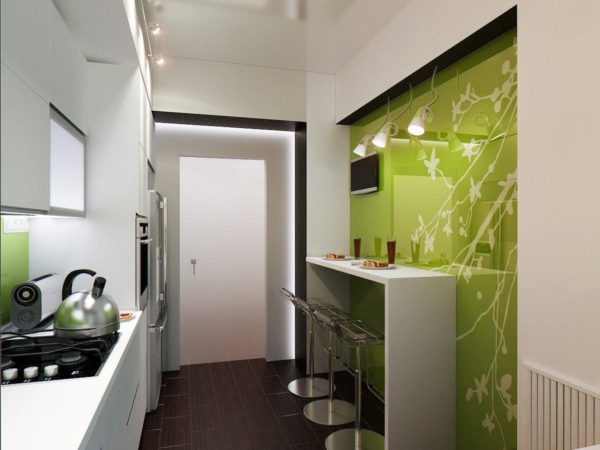
A worktop, for example, will in any case take up more space than its actual indicated dimensions. Because according to the rules, it is placed 20 cm from the wall (so that the electric wires from the washing machine and household appliances passing through the space of the wall are not damaged when some work is done on it).
A whimsical mosaic of placing equipment in a small-sized kitchen sometimes encounters insurmountable obstacles if it turns out to put only a gas stove and a refrigerator nearby. This can be overcome if you buy a refrigerator of a certain model, install a special screen and additional air cooling.
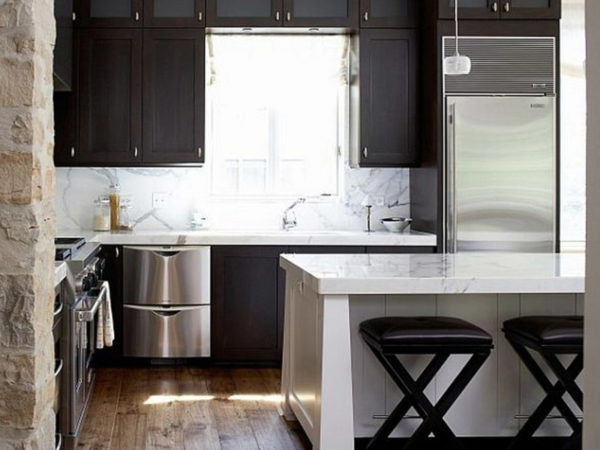
But is it necessary to have such difficulties, if you can plan it differently - take the unit out into the corridor or room, install a telescopic hood, initially buy not a huge refrigerator, but a tall one with smaller dimensions.
The biggest mistake in the design of a small kitchen is the lack of rational placement of objects. Whatever its dimensions, a sink and countertop next to it is normal, just like a countertop next to a gas stove. Even after a short distance, it is inconvenient to carry washed vegetables to the table, or a board with sliced products - from the opposite wall to the stove and pan. This is called ergonomics - the most convenient placement, which saves time and effort.
4 mistakes of the inept mistress
The first - the irrational use of a small space - will inevitably entail the rest 4. The lack of a sufficient number of cabinets leads to an overwhelming utensil. Ideally, all kitchen utensils should not stand in open spaces, but should be folded into a specially designed place.
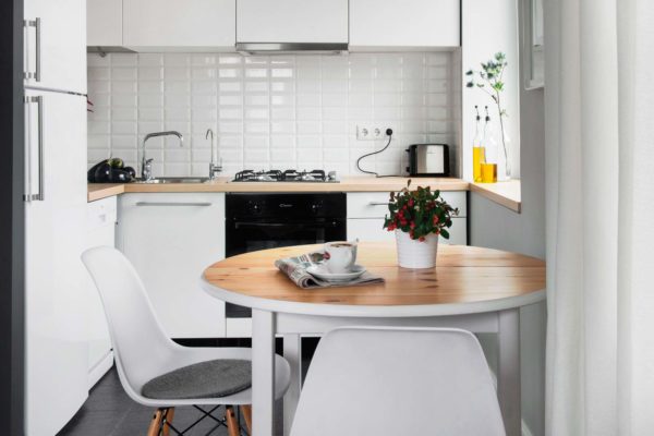
If everything that is available cannot be folded even in the most compact version, then the kitchen has extra items. For example, salad bowls served only to guests, a tray for serving tea, a samovar that is not used for its intended purpose.
Read more: Kitchen design in Khrushchev with a geyser and a fridge 2019
In the kitchen of small dimensions, you can not place decor items. There is no place for decorative napkin holders with colored napkins, dried ears, shelves with souvenirs and figures, duplicating jars with spices, salt shakers and pepper shakers in three versions.
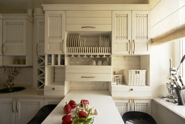
Separating lockers is a sure way to useless space. The distance between the upper and lower is 30 cm, and it is non-functional. At the same time, the upper one is already - with a depth of the same 0.3 m, and the lower one is wider - as much as 45 cm.
If you can find a one-piece set, there will be much more shelves, moreover, full-fledged, almost half a meter. In the lower tier of such a headset you can place household appliances, in the upper tier - all the necessary utensils. Sometimes there is only space on the upper shelves, but large plates and cup dryers do not fit there.
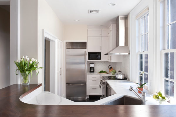
If the kitchen needs a dining table, it can be made folding. This will not only free up the internal space, but also facilitate cleaning if the room is as much as possible packed. Waving a mop, you can not be afraid to hurt your knees and elbows, and putting things in order on the upper shelves - not to look for where to put a stool.
Before you begin planning a tiny workspace, you need to remember the aesthetics of minimalism.
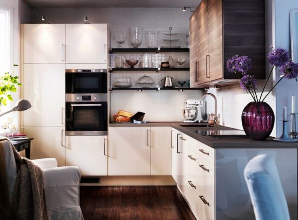
Consider 4 out of 5 errors made during ergonomic use of a limited area:
- a large table, making it difficult to approach with any functional subject and several stools;
- an abundance of decor for which there is no place;
- extra dishes, which place in the sideboard of the furniture wall;
- incorrectly selected headset, which does not fit everything you need.
And the first and main mistake is the lack of professional assistance.
A bit about the rules
Some of the advice given by pseudo-experts is completely inapplicable in the tiny kitchens of the Khrushchev and early brezhnevka. But even among these edifications you can find rational grains, or prohibitions:
- no dining area, it is taken out into the room (on a folding table you can feed 2-3 people if the apartment is one-room and the rest of the household is sleeping);
- no dark tones in the design and cladding (it’s more practical, but the space is visually reduced);
- the use of all possible spaces - a niche under the windowsill, the windowsill itself, the upper planes (including the refrigerator, if its height allows);
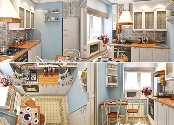
- drawers are more convenient than doors; a chest of drawers can be used in corner space - it does not need a lot of space;
- if the refrigerator is needed in the kitchen, it is bought strictly in size, reserved for it (taking into account the distance to the walls and nearby objects;
- for pots, a cabinet under the sink is equipped, preferably with compartment doors (you have to put a hinged sink, but the saved space is worth it);
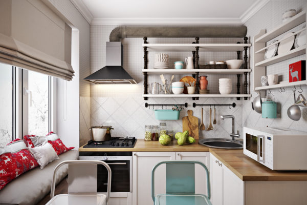
- seasonings and spices are usually placed next to the cooking food (in a cabinet above the countertop) - this will save time and legs, save you from additional irrational walks;
- for each item there should be a place in which the hostess will climb automatically, if the part is on the surface, a feeling of compressed and cramped space is created;
- mandatory accounting of safety rules (otherwise a refrigerator or other household appliance will break down in the first six months);
- a kitchen apron that is not afraid of detergents and is easy to clean.
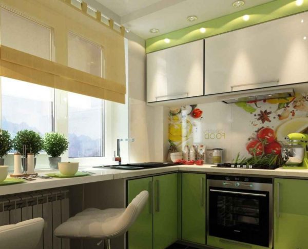
In case of violation of the distances dictated by safety precautions, mandatory installation of safety devices is carried out.
The problem of new-fangled ergonomic developments is the fundamental misunderstanding of planners, what is a truly small kitchenette, where there is no space for a dining table, refrigerator and washing machine.
Read more: French-style cuisine - features and ideas
When advanced designers recommend that you keep the working triangle at least 3 meters high (and seven meters is called the optimal size), and only five are available (or even 4.5 m - the entire room), this seems like a frank mockery.
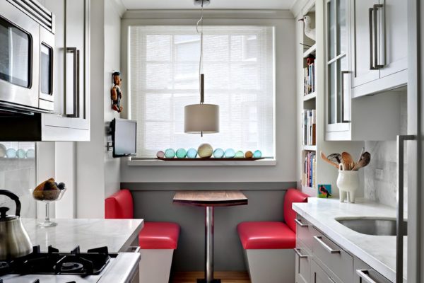
Although it can be a simple misunderstanding, and perplexity, supported by the result of elementary life experience. Do not repeat such mistakes in the design of your own workspace.
A new generation of designers are taught not to place furniture in the kitchen of the Khrushchevs, because the inhabitants of small apartments are unlikely to pay a lot of money. The hostess’s confidence in their own rationality and infallibility, the ability to equip and furnish the family nest without outside dictates and alien opinions may also become an obstacle.



Alas, no comments yet. Be the first!